TERMINAL
ENV
LCD
LOGO
BTN
HUE ASSN
MOOD
INTENSITY
Welcome!
I created this project to showcase my design and front-end engineering skills.
My goal was to deliver an engaging digital experience that demonstrates how brand identity can be translated into memorable, interactive design.
The interface draws inspiration from HAL 9000. As we navigate the current AI revolution, this project serves as a nod to one of the most iconic representations of artificial intelligence from over 50 years ago. It channels the film's visionary aesthetic and pairs unsettling ambient audio, slow pacing, and high-craft visuals to create an immersive, cinematic environment.
I hope you enjoy it as much as I enjoyed making it!
– Dave
HUE 9000 pays homage to Stanley Kubrick's 2001: A Space Odyssey, capturing the film's design principles in a modern interactive experience.
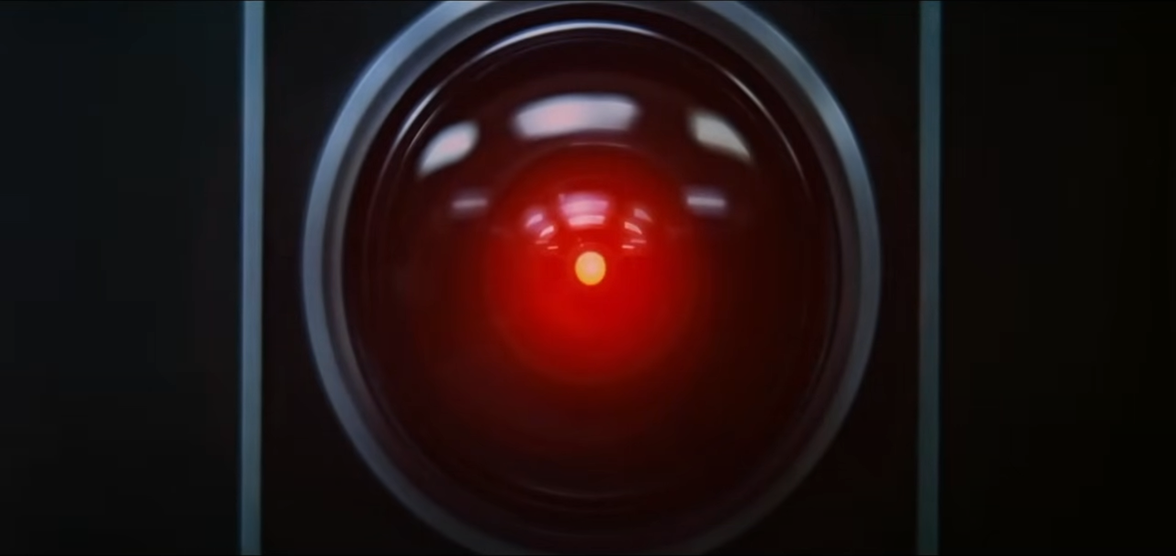
The HAL 9000 lens was a central design focus for this project. To replicate it, I constructed a sophisticated radial gradient by color matching against the film version.
To bring it to life, I created a series of breakpoints at various intensities which can then be interpolated between.
For color modulation, I used the OKLCH color model, which maintains perceptual consistency in chroma and lightness during hue shifts. The inner core retains a subtle color shift like the film's version.
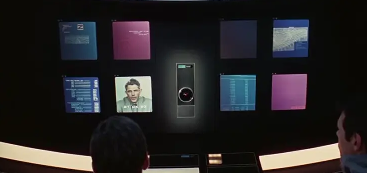
High-contrast lighting and shadows guide user focus and reinforce the cinematic mood. Careful attention was given to the specular highlights on the radial and circular bezels, simulating realistic light reflection as it glides across the curved surface.
Instead of a traditional light/dark mode, I simulated increased ambient lightning, and carefully crafted all surfaces to respond accurately to the lighting changes.
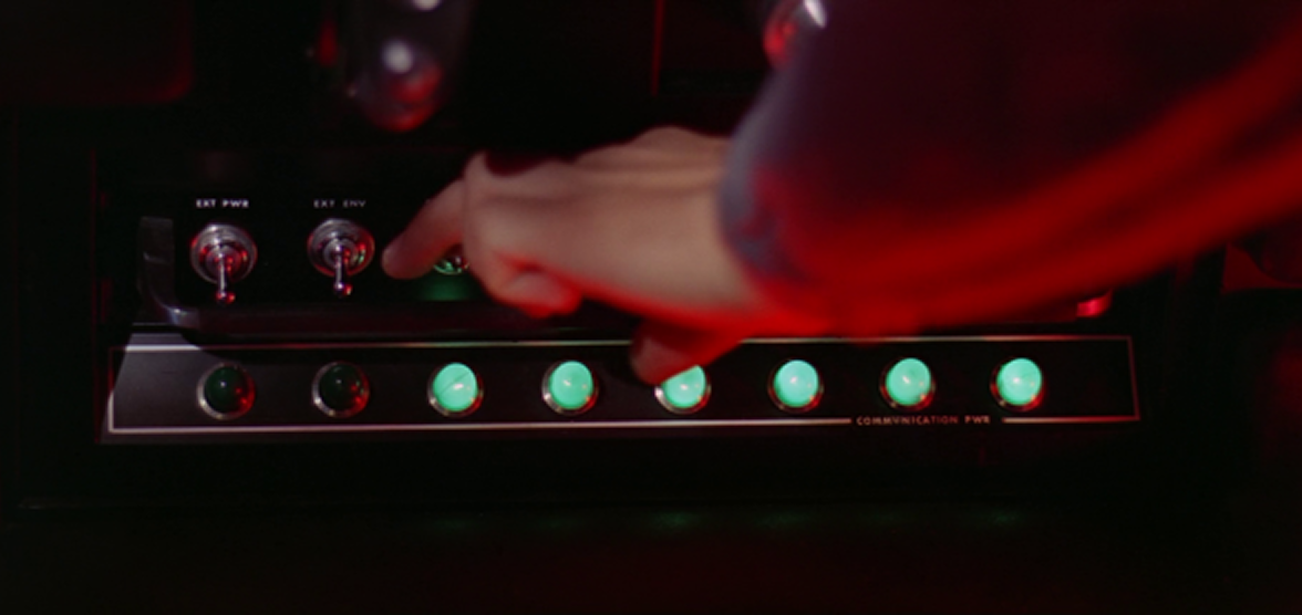
The movie features retro-futuristic buttons with backlight translucent surface. I carefully designed the buttons to emulate this aesthetic.
Each button includes multiple backlit lights and realistic states: unlit, dimly lit, energized, pressed, and selected. Glow, tint, and lighting effects shift in response to interaction. The lights gently pulse at rest, adding ambient movement. Hover and press states are visually rich but restrained, giving each control a sense of weight and physicality without over-animation.
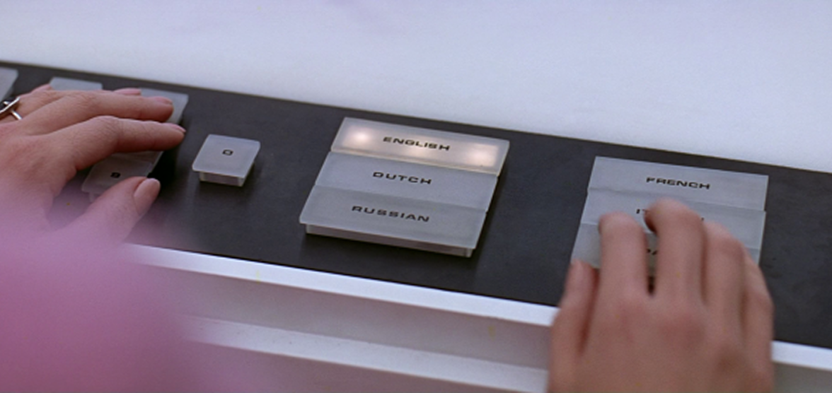
The movie uses abbreviated, all-caps lettering to emphasize function over decoration. I carried that typographic style into the interface, creating visual groupings like HUE ASSN, MOOD, and INTENSITY.
Layout, spacing, and border styles are deliberately rigid and minimal. Despite this rigidity, I designed responsive sections with clear constraints to maintain visual balance and geometric layout across different desktop formats.
I chose lightweight, expressive tools that could deliver on the high-craft visual and interaction design I envisioned. Vanilla JavaScript kept the codebase fast and direct. XState helped organize UI flow and state changes cleanly. GSAP handled complex animations with precision, and Howler.js gave me full control over audio behavior. I leaned heavily on CSS custom properties and the OKLCH color model to manage styling and color transitions with clarity and depth.
Every technology was selected to support a responsive, cinematic experience without compromising on performance or accessibility.
Pulsation effect on unselected buttons
Pulsation effect on selected buttons
Intensity of terminal visual disruptions
Use vibration on actions